
 info@digitalnexustec.com
 +51 979 363 455


5 common web design mistakes that scare away your customers
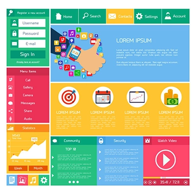
A well-designed website can be the engine of growth for your business. However, there are common web design mistakes that, instead of attracting customers, drive them away. In today’s digital environment, users expect a smooth, intuitive, and fast experience. If your website fails to meet these expectations, you’re missing out on valuable opportunities. In this article, we reveal the five most frequent mistakes you should avoid at all costs to ensure your website works in favor of your brand — not against it.
1. Slow-loading websites
One of the most damaging common web design mistakes is having a site that takes too long to load. Users abandon a page if it doesn’t load in under three seconds. Poor performance not only hurts the user experience but also negatively impacts your SEO ranking.
Optimize images, use caching techniques, choose a reliable hosting provider, and minify CSS and JavaScript files. Tools like Google PageSpeed Insights can help you detect and solve speed issues.
2. Confusing navigation
A cluttered or unclear navigation structure is another reason users leave a website. If someone can’t easily find what they’re looking for, they won’t hesitate to turn to the competition.
Avoid overloaded menus, illogical hierarchies, or broken links. Use clear labels, organize your content logically, and prioritize the user experience. Remember, good website architecture benefits both users and SEO.
3. Lack of responsive design
Another major common web design mistake is not adapting your site for mobile devices. Over 70% of web traffic comes from smartphones. If your site doesn’t display or function well on mobile or tablets, you’ll lose a large portion of your audience.
A responsive design ensures your site looks good and functions properly on any device. Make sure buttons are easy to click, text is readable, and elements are properly adapted.
4. Too many visual elements and poor hierarchy
A website overloaded with banners, animations, loud colors, or mixed fonts can immediately turn visitors away. Visual clutter hampers readability and content comprehension, which lowers conversions.
Establish a clear visual hierarchy: use headings, subheadings, lists, and whitespace to guide users. Minimalist, functional design remains the best practice. Less is more.
5. Lack of clear calls to action
The goal of a website is to prompt an action: for the user to sign up, purchase, contact you, or keep exploring. If you don’t guide the visitor, they’ll simply leave. This is one of the most overlooked — yet harmful — common web design mistakes.
Include buttons with direct messages like “Contact us now,” “Request a demo,” “Buy here,” or “Subscribe.” Place them strategically, use contrasting colors, and ensure they work properly across all devices.